Abstract
A new wordmark, three typefaces, motion and layout rules answer how a global platform can remain recognisable without competing with billions of pieces of content.
Background
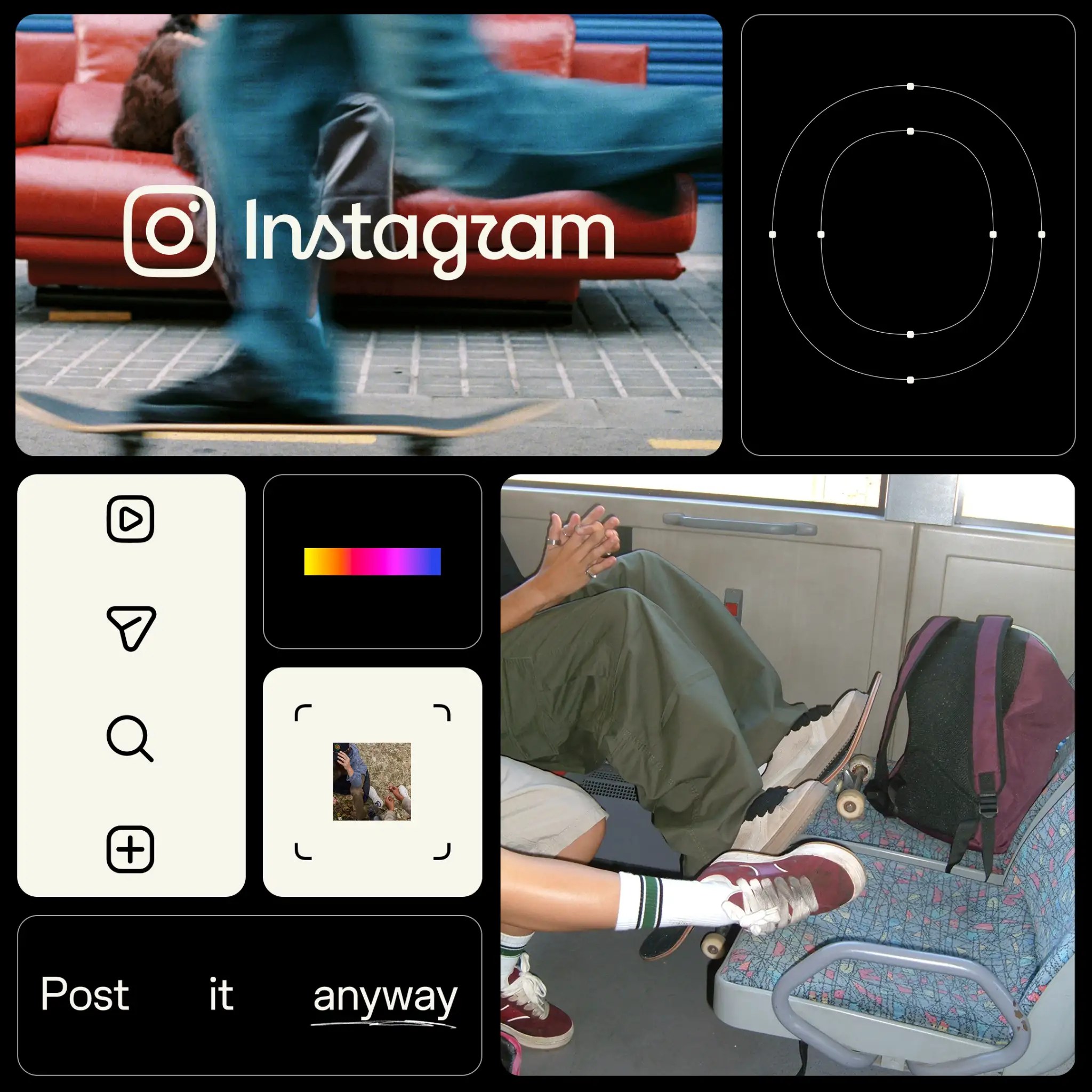
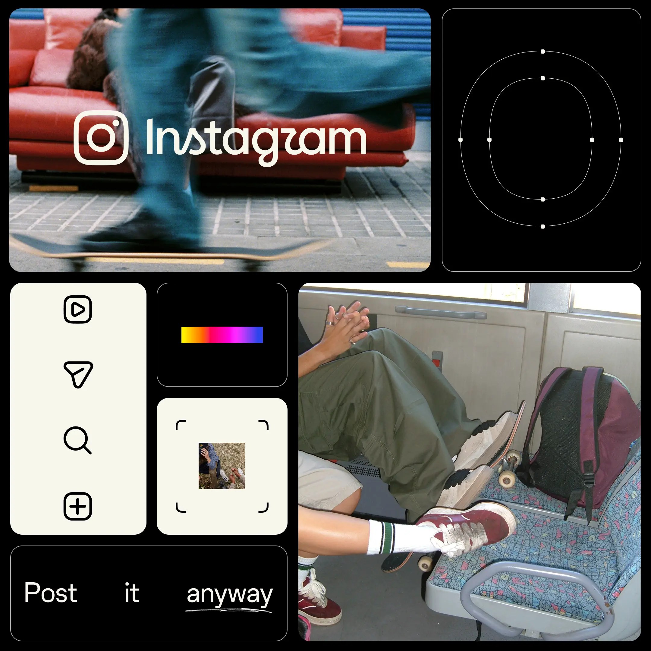
On 13 August, Instagram introduced its most significant identity update in more than a decade. The revised wordmark preserves a handwritten character while using heavier strokes and a simpler structure to improve recognition at small sizes and in rapid browsing; the familiar gradient takes a more restrained role. This is not merely a logo replacement. Type, motion, layout, interface and creator tools are changing together, with the system expanding through global product touchpoints during 2026 and beyond.
Design Analysis
Typography is central to the update. Instagram Sans continues to carry general information, while the new Instagram Pen provides a more gestural voice and Instagram Mono adds a technical tone for data, labels and structured content. Together they let the platform move among clarity, personality and order while adapting to many languages. The design team must account for scripts beyond Latin, different text lengths and reading habits. Globalisation is therefore not only translation, but also type engineering and layout governance.
New motion and layout rules put content first. Brand elements use rhythm, transition and boundaries to identify context while avoiding the centre of the frame; the interface gives more space to photographs, video and words. On a platform where billions of users produce visual material, over-unification would suppress difference while weak rules would create confusion. The update adopts a model of clear grammar and open outcomes, deriving unity from movement and proportion rather than repeating the same decoration on every screen.
AURELIS Position
The refresh also exposes the difficulty of designing a platform brand. Any small change is amplified by a global audience, so wordmark legibility, a quieter gradient and a more restrained interface all require continued testing in real use. The lesson for brand practice is that a mature system should not pursue a single moment of shock; it should reserve room for future content, languages and functions. The best platform identity does not constantly announce itself, but allows every touchpoint to belong to one world without interrupting creation.
Keywords
Instagram / Brand Identity / Typography / Motion System / Global Platform